|
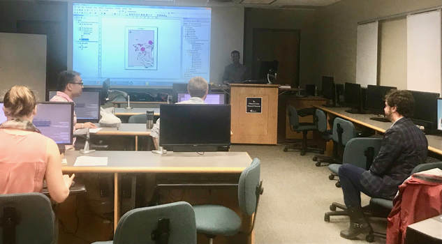
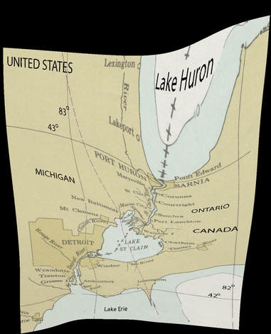
Meredith Denning An old geographer that I know once asked me, “Isn’t environmental history just historical geography?” and then we had a long talk about methodology, the agency of non-human actors, and interdisciplinary research in general. I think I convinced him that EH is a field in its own right, though it may simply have been a case of my dad letting me win an argument. In any case, I’m absolutely convinced that maps are a very important part of any presentation of historical research, and I’ve made a few attempts to pick up GIS skills at Georgetown. I made my first attempt while working as assistant to the Director of Doctoral Studies, charged with creating useful workshops for history grad students. I asked two of the campus librarians, trained in ArcGIS at university expense, to run a series of workshops to teach interested students to use the software. The three of us put together an introductory day and I sent out invitations. A dozen people showed up for the first session, but it quickly became clear that (a) the instructor detested GIS and (b) the questions that historians wanted to address using maps were very, very different from the questions that the software developers envisioned. Even allowing for the time and effort needed to acquire the specialized vocabulary of the ArcGIS program, it didn’t seem well-adapted to historical research. Since then, two historians have created and run GIS workshops at Georgetown and while the experiences they shared did reinforce the message that ArcGIS takes a lot of time to learn, I’ve begun to appreciate the ways in which it can be used. It really helped to learn from historians, because they understood what I and other grad students were trying to accomplish. For example, non-GIS historians often want to: - create digital files that combine maps or charts from archival documents with modern maps. - put customized points and lines on an accurate map In fall 2016, Michal Polczynsky, a Georgetown alumnus who studies the medieval history of the Black Sea region, invited history grad students to bring a digital copy of an archival document to his GIS workshop. I brought along a scanned page which showed a detailed map of the Canada-US border between Lake Huron and Lake Erie. While we took copious notes, Mich explained how to turn our scanned documents into a semi-transparent ’layer’ that could be superimposed over a modern satellite map, almost like laying two overhead transparencies on top of each other. We linked the current and archival maps by identifying points that were common to both. For example, the city of Detroit was on my archival map and on the modern satellite map. Since the archival documents were rarely perfectly accurate, they tended to look rather stretched and odd once we had done the work of linking these matched points (see photo). However, it was fascinating to see where the historical mapmakers had been mistaken, and in Mich’s work, the combination of satellite imagery and medieval maps had enabled him to locate long-destroyed fortifications and buildings with precision. Geoff Wallace, who studies the environmental history of the Yucatan and was visiting us from McGill, conducted a workshop this spring that was very helpful for putting points and lines on a graph. He explained the differences between raster and vector data quickly but clearly. (Raster data is plotted on a grid of squares that cover the area in which a given physical feature lies, while vector data are lines, points and shapes). Having done that, he then led the group through the process for creating data points and plotting them over a modern map and exporting the whole thing to a PDF. Geoff also shared a number of simpler, Mac-compatible software tools that can help historians perform this task with minimal confusion while taking up less space on one’s hard drive than ArcGIS. After completing these three different workshops, I feel as though I have a better sense of how I can expect ArcGIS and other mapping software to behave. I find that if I think of ArcGIS as a series of overhead transparencies or sheets of semi-translucent graph paper, the program’s insistence on layers makes more sense. Likewise, when one considers the process of creating a paper map, beginning from an outline of a land mass, filling in areas with color, placing specific shapes, and finally adding a compass, scale, legend and title, the arrangement of the tools in ArcGIS is more intelligible. Or maybe just more sympathetic and approachable. I have a number of archival ‘spreadsheets’ that list water observations about water quality with precise locations, I plan to create some proper data sets to map in the near future. I have the enormous good luck to be studying a place that has been frequently surveyed, with many digital files readily available. The workshops have shown me how much the availability of data sets can vary, depending on the number of people researching a place and depending on the means and willingness of governments to facilitate access to these kinds of tools. Furthermore, as an historian I’ve noticed that shape-files are readily available for political boundaries that exist in the early twenty-first century in the Western Hemisphere, but remarkably scarce for all other times, even the last decades of the twentieth century. Meredith Denning is recent graduate of Georgetown University’s history PhD program. Her research focuses on the environmental and diplomatic history of Canada and the United States. In addition to her historical pursuits, she takes an interest in contemporary environmental policy and the local politics of her hometown, Toronto. She enjoys canoe tripping, bicycling, and urban gardening.
0 Comments
|
EH@G BlogArticles written by students and faculty in environmental history at Georgetown University. Archives
May 2020
Categories |


 RSS Feed